A ground-up mobile redesign of a 20-year-old enterprise attendance system, split into two focused apps: one for the people who clock in, one for the managers who run the shift.
Lead UX/UI DesignerTools: Adobe XD, Figma, Material Design
In a nutshell
1Understanding: a 20-year-old attendance app, powerful but dated, that workers were made to use and quietly resented.
2Benchmarking: 15 interfaces mapped, 4 in-house and 11 rivals, to define what a modern punch-clock looks like.
3Interviews: five stakeholders across business, product, dev, marketing and sales pointed to where it really hurt.
4Personas: three profiles, two on the floor and one running it, set the direction.
5The split: one tangled login became two purpose-built apps, Employee and Manager.
6Prototyping: low-fidelity flows in Miro, then a full high-fidelity build in Adobe XD.
7Design system: Material Design, accessibility to WCAG, and a navy palette built for contrast.
8Localisation: shipped in European Portuguese, English, Spanish and French.
9Handover: a fully functional prototype, signed off by the product owner screen by screen.
By the numbers
2Apps delivered
1,000+Employees per client
10,000+Active users
1 · The Challenge
Powerful software nobody enjoyed using
Actuasys is a software house in Maia, Portugal, with twenty years in attendance and HR management for large European employers, firms and public bodies with 10,000+ users clocking in every day. Its most complete product, the Expert App, did almost everything: clock-ins, absences, vacation requests, even cafeteria bookings. We were brought in to rebuild it for mobile, from the ground up.
“Old, developed internally, not the prettiest, and not functional.”
Nuno, Product Owner
“The design is the big mistake of this application, and it doesn’t work on new phones.”
Daniel, Development
The problems with the old system
The legacy Expert App was a dense, list-first home that hadn’t kept pace with the phones people actually carried. Pulling the threads together, six problems defined the brief.
table_chart
A dated, in-house UI
Built internally and rarely refreshed. By the team's own admission it was old and not functional, a tool staff merely put up with.
smartphone
Broken on modern phones
The layout fell apart on newer devices. For an app people open on the factory floor, that alone made daily tasks a fight.
lock
Two logins, two minds
Employees and managers signed in to the same shell with different credentials. Users disliked the duality, "it would be easier to have two applications."
notifications_off
Imposed on staff
Companies hand the app to staff, so goodwill starts at zero. As one stakeholder put it, "employees end up not having the best view of it."
build
Painful to maintain
Even the developers struggled. Opening the project to fix a bug or meet a client request was "very difficult, we don't have resources for that time."
schedule
A rigid-shift reality
Clients run 1,000-plus people on fixed shifts, no flexible hours, home office only by exception. The design had to fit a clocked-in, shift-based workforce.
How the project ran
The plan was a straight research-led arc: understand the product and its people first, then ideate, prototype, and validate before handing over a build-ready file. One curveball, the UX designers who ran the early research rotated off mid-project, shaped how the later stages worked. More on that in the design system section.
2 · Exploratory Research
What a modern punch-clock looks like
Before drawing a single screen, I mapped the field. Fifteen interfaces in all: the four faces of Actuasys's own suite (web and app, for employee and manager) alongside rivals like Clock Punch, Folha Certa, Ponto Go and Sesame. Every screen went onto a Miro board and got scored on the same rubric.
Clock Punch
checkOne-tap clock-in, front and centre.
closeEverything else buried behind it.
Folha Certa
checkComplete record of every entry.
closeDense, spreadsheet-like screens.
Ponto Go
checkClean, modern, role-aware home.
closeThin on manager-side tools.
Sesame
checkDashboard that frames the day well.
closeAimed at flexible teams, not shifts.
What the benchmark made clear
schedule
73% clock in from the app
Nearly three in four rivals let you punch in on the phone itself. Expert App did not. This became the single biggest feature gap to close.
bar_chart
100% show your data
Every competitor let people view their own attendance record. Pure table stakes, and a baseline the new app had to clear without question.
group
46% run hybrid by role
Almost half changed what you see based on who you are. A strong hint that the employee and manager experiences wanted separating.
dashboard
46% lead with a dashboard
Half opened on a single view that pulled the day together. Expert App had no such home, and it was the first thing I set out to build.
The foundation was already in the building
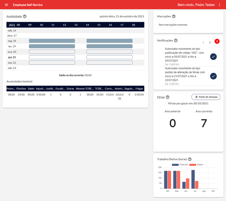
The benchmark surfaced an unexpected ally. Expert also had a web version, no clock-in, just schedules and justifications, but with an interface markedly friendlier and more functional than the mobile app. It became the base of the whole project: same brand, same Material Design foundation, carried onto the phone instead of reinvented.
Expert Web: the design base
Cleaner hierarchy, real components, and a brand the company already trusted. Rather than start from a blank canvas, I lifted what worked here onto mobile and let the two products finally feel like one system.
3 · Voices from the Floor
Five conversations that set the brief
Between October 25 and 29 I interviewed five people tied to the product, each with a protocol tuned to their discipline: Filipe (business), Nuno (product owner), Daniel (development), Francisca (marketing) and Joana (sales). Reading across the transcripts, three quotes did more to shape the work than any feature list.
“The login, user and password for employee and manager is different. I don’t like that duality of logins, it would be easier to have two applications. When I want the manager side, I just go to the web.”
Nuno, Product Owner
“The mobile element is a differentiator. On its own it rarely wins a deal, but we never get left out for lacking mobile, and we get very much in for having it.”
Joana, Sales
“What causes the most strain is opening the project for maintenance, to fix bugs or meet a client need. It is very hard for us, we don’t have the resources to spare that time.”
Daniel, Development
4 · User Empathy
Three people on the clock
The interviews and the client's own user data converged on three recurring profiles, two on the floor and one running it. A persona was built around each, and every one carried a specific friction that shaped a screen later in the project.
Maria, 42
The Frontline Worker
Supermarket shift worker who just needs to know her punch counted, and to see what she's working this week.
Joaquim, 27
The Routine Operator
Metalworker who checks his clock-in every day and books the canteen around a fixed shift pattern.
António, 38
The Floor Manager
Runs a factory team and needs the day's absences, pending approvals and the week's rota at a glance.
About Maria
Maria commutes from Mafra to a Lisbon supermarket and works a rotating shift pattern. The app is not optional, it is how her hours are recorded and paid.
Her worry is simple and constant: did my clock-in actually register? A missed punch is an argument with payroll, so she checks, and she wants the answer in one look.
Motivations
Certainty
95%
Speed
80%
Simplicity
90%
Tech comfort
45%
Goals, behaviours & pain points
Goals
Confirm her punch is in the system
Fix a wrong entry before payday
See the week's shifts ahead of time
Behaviours
Checks the app right after clocking in
Uses her phone in short bursts at work
Calls HR when something looks off
Pain Points
Never sure a punch was recorded
No clear way to flag a discrepancy
Old app hard to read on her phone
The decision Maria shaped
Surface the last clock-in, highlighted, the moment the home screen opens, so it is instantly obvious whether it counted. Pair it with a clear path to flag anything wrong.
About Joaquim
Joaquim lives and works in Braga at a large metalworks. His week runs on a fixed pattern, so his app use is habitual: clock in, confirm it landed, and plan around the shift.
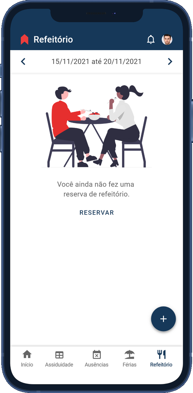
The on-site canteen runs on advance booking, so once he knows his schedule he wants to reserve meals for the week in the same place, without hunting through menus.
Motivations
Certainty
90%
Routine
88%
Convenience
82%
Tech comfort
70%
Goals, behaviours & pain points
Goals
Confirm each clock-in registered
Book the canteen for the week
Keep his routine running smoothly
Behaviours
Opens the app at the same times daily
Plans the week around his shift
Comfortable with phone apps
Pain Points
Canteen booking lived elsewhere
No quick read on attendance status
Too many taps for routine tasks
The decision Joaquim shaped
Bring cafeteria booking into the employee app, beside attendance and schedule, so the weekly routine lives in one place instead of three.
About António
António runs a team on a clothing factory floor. His morning starts with one question: who is in today, and who is not? Unplanned gaps stall a production line.
He also sits on a queue of leave and absence requests that need his sign-off, and he plans the team's rota. The old flow pushed him to the web for half of this, which slowed everything down.
Motivations
Oversight
92%
Speed
88%
Control
85%
Tech comfort
75%
Goals, behaviours & pain points
Goals
See the day's absences in advance
Clear pending requests quickly
Plan the team's shift schedule
Behaviours
Checks the team first thing
Approves on the move, not at a desk
Switched to web for manager tasks
Pain Points
No single view of who's out
Approvals scattered and slow
Forced onto the web mid-task
The decision António shaped
Give managers their own app, opening on a dashboard: who is in, what needs approving, and the rota, with one-tap actions so a decision never waits for a desktop.
One product, split in two
Maria and Joaquim clock in from the floor; António runs the shift from an office. Forcing all three through one shared login, the loudest complaint in research, meant the home screen never fit anyone. So the single tangled product became two focused apps, each opening on the one job that matters, and the login duality disappears.
App Employee
For the people on the clock
Attendance, with the last punch surfaced
Absence requests and history
Vacation: booked, remaining, used
Cafeteria booking for the week
App Manager
For the people running the floor
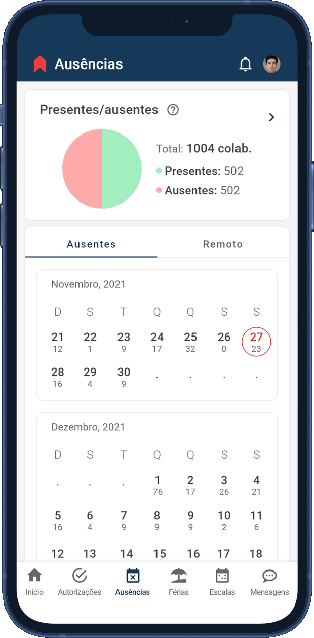
A dashboard of who's in and who's out
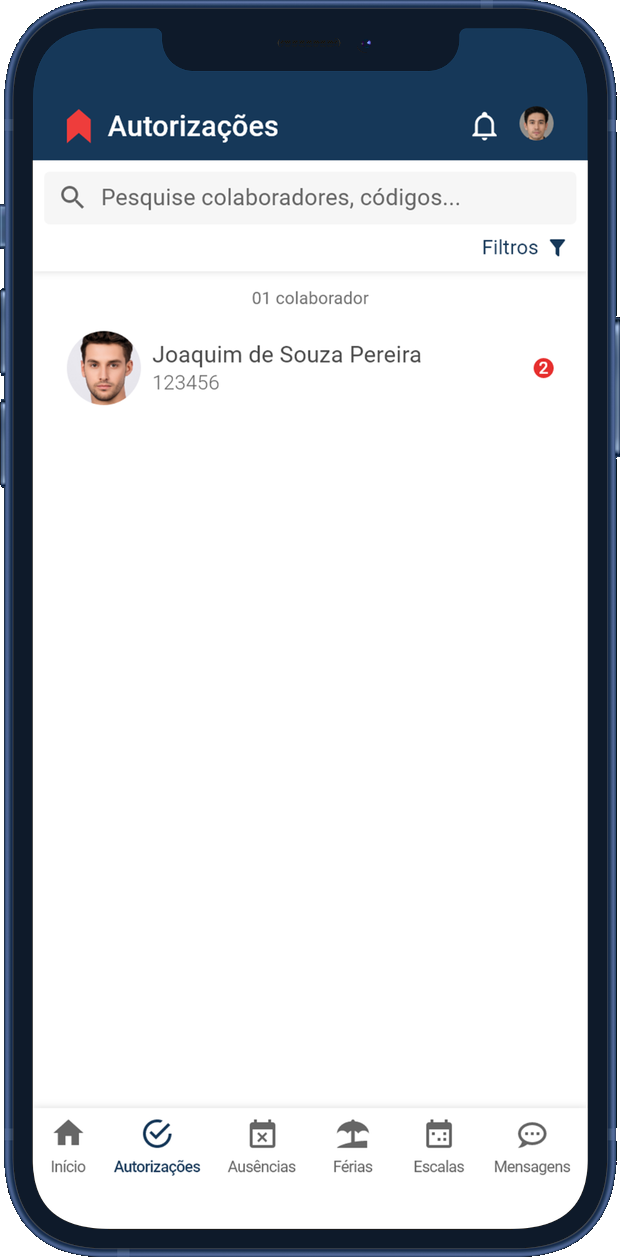
One-tap approvals for absences and leave
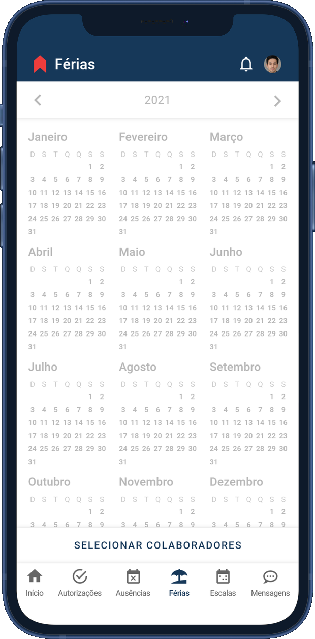
Team vacation on a single calendar
Shift scheduling and broadcast messages
5 · Prototyping
From boxes and arrows to real screens
Both apps started as wireframes in Miro, sketched as one connected flow before any visual design. Cheap to draw, cheap to change, and reworked until the structure held.
Attendance calendarThe whole month at a glance, every clock-in on the grid.
‹mês 2021›
Saldo 12 dias
Acompanhar solicitações
New requestPick what you're asking for, time off or an absence.
‹ Nova solicitação
tipo de solicitação
Selecionar
Férias
Ausência
Confirmar
Choose datesJust set the days a holiday covers.
‹ Nova solicitação
Férias
período
dd/mm/aaaa
Confirmar
Add detailsThe reason, the day, and any proof to back it.
‹ Nova solicitação
Ausência
motivo
Selecionar
dia
dd/mm/aaaa
anexo
Carregar
Confirmar
Request confirmedA clear confirmation that the request went through.
mês 2021
Solicitação realizada
OkCancelar
Absences & holidaysEverything you've asked for, kept in one list.
Ausências e Férias
Acompanhar solicitações
Pedido de ausência13/10/2020
Edit requestChange a request before anyone reviews it.
‹ Editar solicitação
Ausência
motivo
Falta justificada
dia
12/03/2021
anexo
Carregar
Editar
Why the order mattered
The apps could have shipped a dozen features at once, but the development team had no room to build and maintain them all. So I built what people were angriest about first, and let the rest follow by how much it hurt to live without.
1
Proof first
Workers never knew if a clock-in had registered, and a wrong entry could cost them at payday. I led with the home screen that shows your last punch on open: the loudest complaint, answered cheaply with data the system already held.
2
Then the requests
Next came acting on it: requesting a day off or holiday from the phone. I held these back until testing fixed a confirmation gap, since a request you can't tell went through is worse than none.
3
The manager's daily job
Managers clear approvals and check who is in every day; the shift rota is a weekly job. So the dashboard and one-tap approvals shipped before the fuller scheduling tools.
4
Everything else, later
Nice-to-haves like canteen booking and a richer schedule became fast follows, close behind launch, so they never delayed what people were actually waiting for.
Rebuilt on Material, tuned for the final users
layers
Material as the base
Both apps carried over Expert Web's Material Design foundation instead of reinventing it. The brand stayed familiar to users, and there was far less for the team to maintain.
visibility
Contrast checked to AAA
Every colour pairing was measured against WCAG before it shipped. The core navy on white clears 12.4:1, comfortably past the AAA bar, so the screens stay legible for everyone.
water_drop
Colour with meaning
Colour was never left to signal on its own, but where it did it stayed consistent across both apps: red for negative, green for positive, blue for neutral actions.
title
Type sets the hierarchy
Roboto at 14 and 16px, with weight rather than size doing the work of hierarchy. Greys were held above the minimum contrast, so nothing important ever dropped into a whisper.
public
Native in four languages
Language was a design input from day one. A Brazilian team building for European Portuguese users worked from a PT-PT glossary, then shipped in Spanish, English (UK) and French.
App Employee: proof in a glance
Every screen answers a worker's real question fast, starting with the one Maria and Joaquim asked most: did my clock-in count?
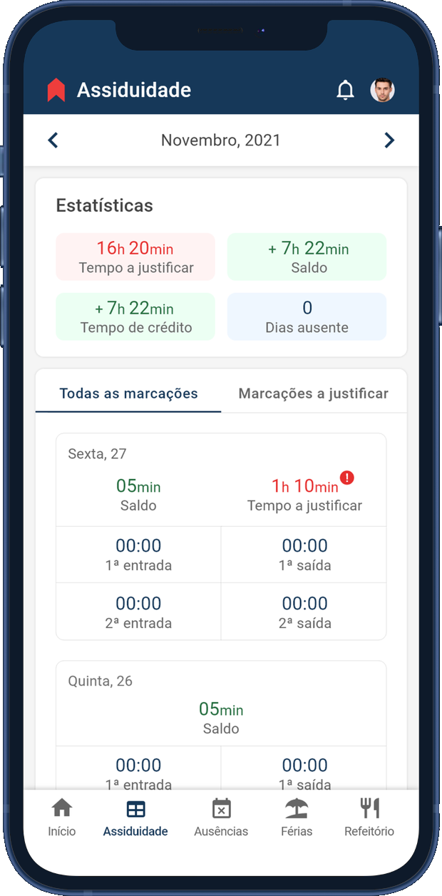
AttendanceBalance and time to justify lead the screen, with the latest entries right below. Maria's "did it count?" answered instantly.
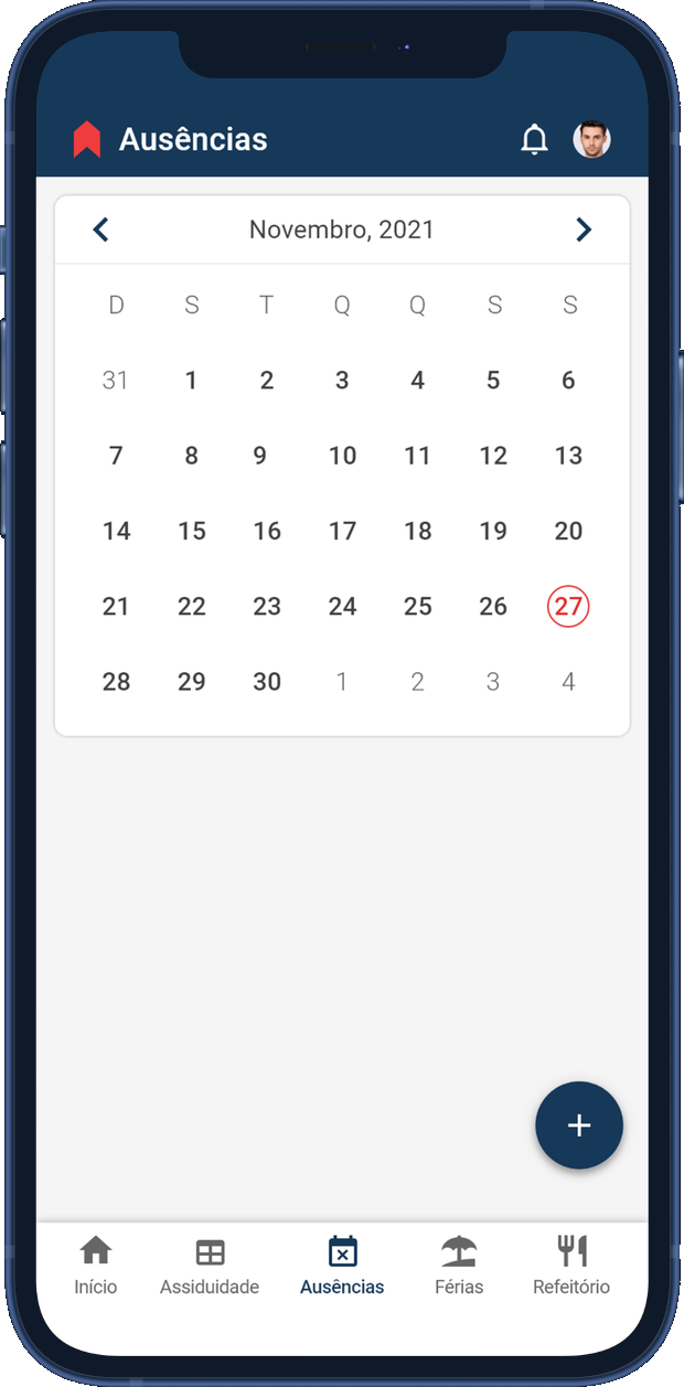
AbsencesA clean monthly calendar to log and track time off, with a single button to start a new request.
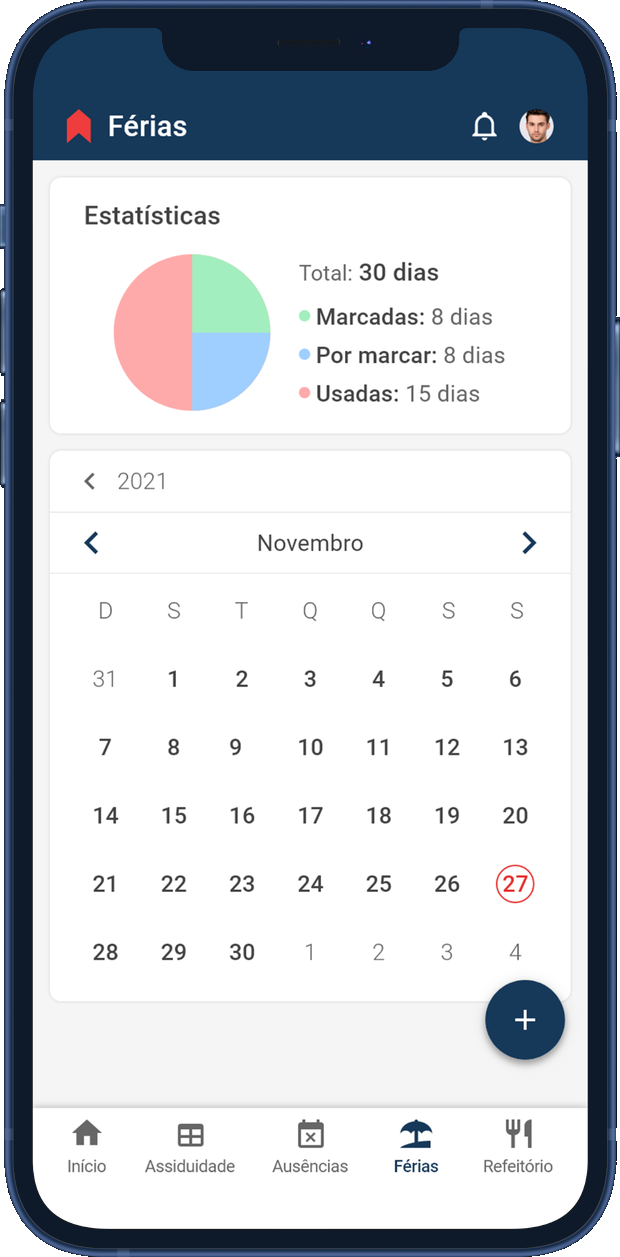
VacationDays booked, still to book and already used, shown at a glance before the calendar to request more.
CafeteriaReserve meals for the week beside attendance and schedule, the routine Joaquim wanted in one place.
App Manager: the floor at a glance
A separate app that opens on a dashboard, so António sees the day, clears his queue and plans the rota without ever reaching for a desktop.
ApprovalsPending absence and leave requests in one queue, each cleared with a single tap, approve or decline.
Team absenceWho is in and who is out today across a 1,064-person workforce, with the month laid out below.
VacationThe team's booked leave on one calendar, so approving the next request is an informed call, not a guess.
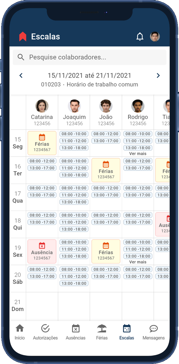
SchedulingBuild and read the week's rota for the whole team in a single grid of shifts.
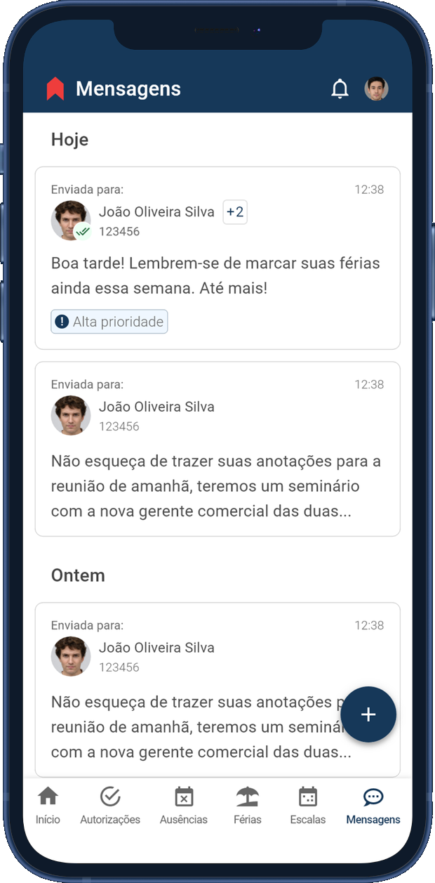
MessagesPush a notice straight to the employee app, so the floor hears it where they already are.
From tolerated to trusted
Same engine underneath, a completely different thing to hold. Set the legacy home beside the rebuilt one and the shift is hard to miss: a wall of options nobody enjoyed opening became a calm screen that answers the day's first question on sight.
Before
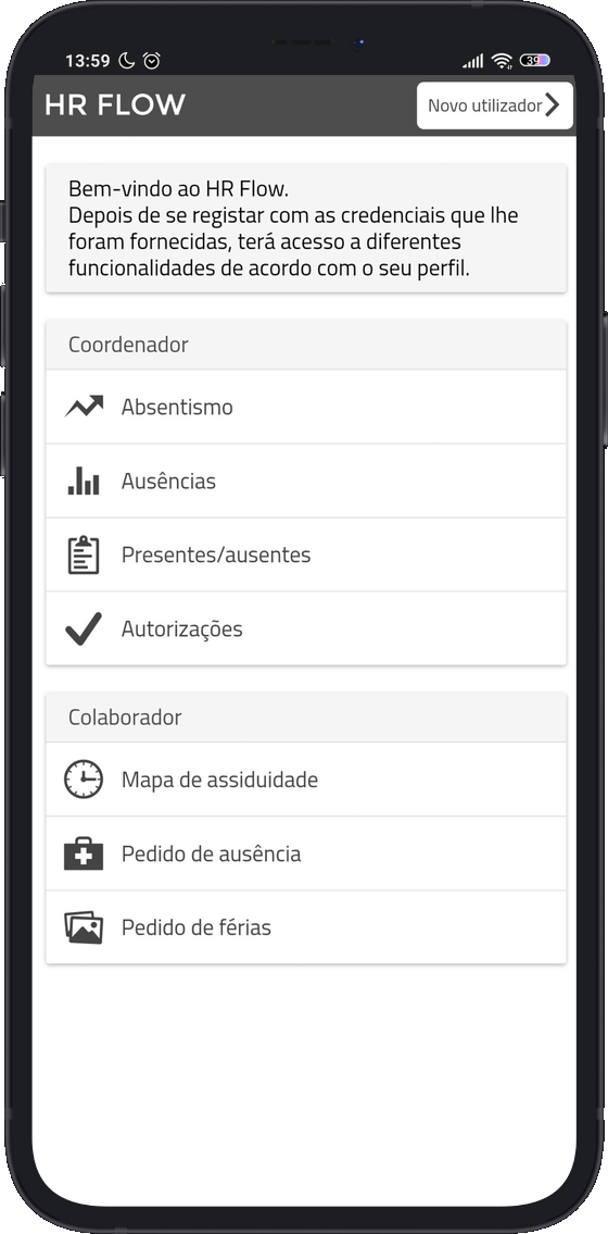
The legacy app
Dated, in-house UI. Built internally and rarely refreshed, and by the team's own admission old and not functional, a tool staff merely put up with.
Broke on modern phones. The layout fell apart on newer, larger screens, turning everyday tasks into a fight on the very devices people were handed.
Two logins in one shell. Employee and manager signed in with different credentials to the same app, a duality users openly disliked.
No clock-in from the phone. 73% of rival apps let staff punch in on the device; Expert App still did not, the single biggest gap.
Hard to maintain. Its components followed no shared library, so every change was hand-built, and even the developers who made it had no time to spare.
After
The rebuilt system
Opens on the last punch. The home leads with the answer to "did it count?", the question Maria and Joaquim asked most.
Split into two focused apps. One for the floor, one for the manager, so no shared login and no home screen trying to please everyone.
Balance and time to justify, up top. The numbers people actually check lead the screen, the latest entries a glance below.
Rebuilt on Material. A real component library replaced the ad-hoc UI, keeping the brand familiar and cutting what there was to maintain.
Accessible and multilingual. Contrast checked to WCAG AAA and shipped in four languages, starting with European Portuguese.
6 · Validation
Six sessions before handoff
Before I called the prototype done, I ran six moderated remote sessions on it, solo: four floor employees and two team managers, each thinking aloud over a video call while sharing the Adobe XD prototype on their own screen. The core flows held up, and it scored 84 out of 100 on the System Usability Scale, the standard usability survey testers fill in at the end. What follows are the issues that changed the build before handoff.
CriticalNo confirmation on submit
Two of four sent an absence request, saw no sign it had worked, and sent it again. The app never told them it went through. A clear success screen fixed it.
MajorThe request action hid
Three of four dug through the calendar and menus to find how to request time off. It wasn't where they looked. I moved it to a labelled button on the absences screen.
MajorApprovals read as a button
Both managers froze on the pending count, afraid one tap would approve everyone at once. I made it open the list instead, and kept approval to a tap per request.
MinorA term read as Brazilian
One worker caught a canteen label that sounded Brazilian to a Portuguese ear. A small thing, still wrong for its users. Fixed against the PT-PT glossary.
7 · Impact
More than a handoff
I handed off a build-ready prototype, signed off screen by screen. What it did after that mattered more than the handoff itself.
trending_up
Actuasys got behind it
The client took to it fast and read it as a sales lever. As their commercial team put it: a strong mobile app rarely wins a deal alone, "but we never get left out for lacking mobile, and we get very much in for having it."
emoji_events
A prize, and a stage
The project won an internal prize, and I was invited to present it to the whole company, more than once. Getting to tell its story to the people I had built it beside meant as much as the sign-off.
8 · Reflection
What the project taught me
Two things from this project stuck, and I lean on both now.
person
Trust starts at zero
Nobody chose this app; their employer handed it to them. What won them over was small: seeing their punch had counted the second they opened it. I bring that starting point to every internal tool now.
description
Document like you'll leave
When the researchers who set the direction rolled off halfway through, only the documentation carried the thread. Now I write and share as if I could be gone tomorrow, so the work holds together as the team changes.