Powerful software nobody enjoyed using
Tessel is an attendance and HR system with twenty years behind it, used by large European employers, firms and public bodies with 10,000+ users clocking in every day. It did almost everything: clock-ins, absences, vacation requests, even canteen bookings. We were brought in to rebuild it from the ground up, and in its latest iterations it became agentic: AI handles the routine, and a person stays in charge.
Tessel is a stand-in for a product that shipped under another name and brand, built for a company I can’t name, so confidential information and features have been changed or left out here.
Most HR software hands people a tool, and lately that tool is AI. Tessel turns it around: agents run the everyday HR on their own, approving, answering and reminding, and HR is the tool they reach for when a case needs judgement, above all when the stakes are high.
“Old, developed internally, not the prettiest, and not functional.”
“The design is the big mistake of this application, and it doesn’t work on new phones.”
The problems with the old system
The legacy app was a dense, list-first home that hadn’t kept pace with the phones people actually carried. Six problems defined the brief.
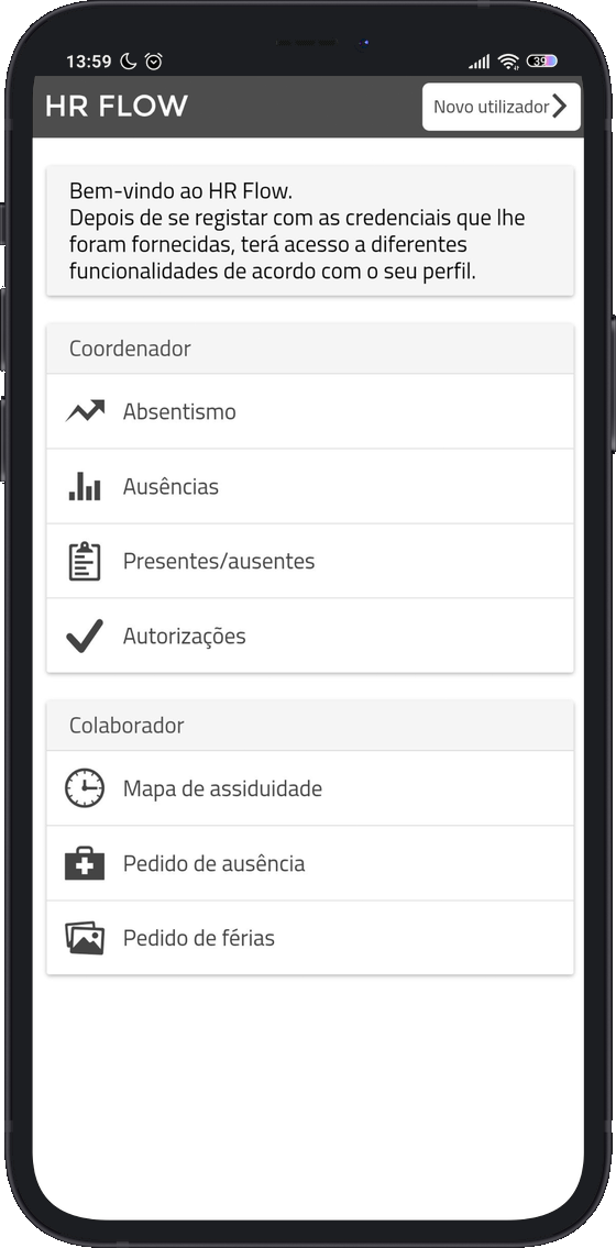
Built internally and rarely refreshed. By the team's own admission it was old and not functional, a tool staff merely put up with.
The layout fell apart on newer devices. For an app people open on the factory floor, that alone made daily tasks a fight.
Employees and managers signed in to the same shell with different credentials, and users disliked switching between the two.
Companies hand the app to staff, so goodwill starts at zero: people open it because their pay depends on it, and few of them like it.
Even the developers struggled. Every bug fix or client request meant reopening code that followed no shared library, and the team had no time to spare for it.
Clients run 1,000-plus people on fixed shifts, no flexible hours, home office only by exception. The design had to fit a clocked-in, shift-based workforce.
How the project ran
The plan was a straight research-led arc: understand the product and its people first, then ideate, prototype and validate before handing over a build-ready file. The autopilot came later, after launch, and the final design picks up that part of the story. One curveball shaped the later stages: the other UX designers on the project rotated off halfway through, which the reflection comes back to.
What a modern punch-clock looks like
Before drawing a single screen, I mapped the field. Fifteen interfaces in all: the four faces of the client’s own suite (web and app, for employee and manager) alongside rivals like Clock Punch, Folha Certa (now Flash), Ponto Go and Sesame. Every screen went onto a Miro board and got scored on the same rubric.
 Clock Punch
- The clock-in button fills the top of the home screen, one tap after opening.
- Requests, history and the timesheet hide in a side menu, three taps down.

- The whole month of punches in one table, with each day’s balance beside it.
- On a phone that table shrinks to tiny cells, with nothing flagged for attention.

- Workers get their own app, opening on today’s punches and open requests.
- The manager side stops at approvals: no rota and no view of who is in.

- The home opens on today: hours worked so far, the next shift and requests waiting.
- Built around flexible hours and remote days, with fixed shift patterns bolted on.
What the benchmark made clear
Eight of the 11 rivals put a clock-in button on the phone’s home screen, Clock Punch most of all. The old app had none, so this was the first gap to close.
All 11 let people see their own punches, from Flash’s monthly table to Sesame’s daily summary, so the new app had to show at least that much from the first release.
Five of the 11 changed the home depending on who signed in, and Ponto Go went further with a separate app for workers. Workers and managers needed different starting points.
Five of the 11 opened on a summary of the day, the way Sesame shows hours worked and the next shift. The old app opened on a menu, so the new home was the first screen I designed.
The foundation was already in the building
The benchmark also turned up something useful inside the client’s own suite: a web version, with no clock-in, just schedules and justifications, but friendlier and more functional than the mobile app. It became the base of the whole project: the same Material Design foundation, carried onto the phone instead of reinvented.
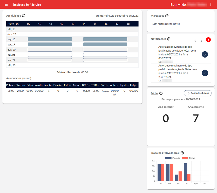
Cleaner hierarchy, real components, and patterns the company already trusted. Rather than start from a blank canvas, I lifted what worked here onto mobile and let the two products finally feel like one system.
The conversations that set the brief
Between October 25 and 29 I interviewed five people tied to the product, each with a protocol tuned to their discipline: Filipe (business), Nuno (product owner), Daniel (development), Francisca (marketing) and Joana (sales). I also sat down with the people who use it every day: workers clocking in on the floor and the managers signing off their requests. Reading across the transcripts, three quotes did more to shape the work than any feature list.
“The login, user and password for employee and manager is different. I don’t like that duality of logins, it would be easier to have two applications. When I want the manager side, I just go to the web.”
“The mobile element is a differentiator. On its own it rarely wins a deal, but we never get left out for lacking mobile, and we get very much in for having it.”
“What causes the most strain is opening the project for maintenance, to fix bugs or meet a client need. It is very hard for us, we don’t have the resources to spare that time.”
Three people on the clock
Most of these users work for traditional employers, many of them state-owned, where remote work is the exception and the law requires every hour worked and every request to be on record. The interviews and the client’s own user data converged on three recurring profiles, two on the floor and one running it. A persona was built around each, and every one carried a specific friction that shaped a screen later in the project.
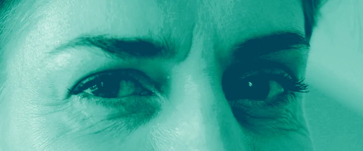
Cashier at a Lisbon supermarket on rotating shifts, who checks every clock-in because a missing punch once cost her pay.
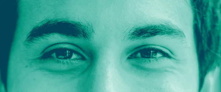
CNC operator at a Braga metalworks on a fixed 8-to-5, who books his canteen lunches every Thursday for the week after.
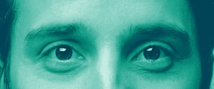
Floor manager at a garment factory with 42 people on two shifts, who starts every day working out who is missing.
Maria has worked the tills at the same Lisbon supermarket for eleven years. On early weeks she leaves Mafra at 5:50; on late weeks she is home after eleven. The app gets her attention in short bursts: at the staff door, on her break, on the train home.
Her worry is simple and constant: did my clock-in register? Last spring a missing punch came off her pay, and getting it back took two calls to HR and a signed form. Now she checks after every clock-in and takes a screenshot whenever she can.
- See in one look that today’s punch counted
- Fix a wrong entry before payroll closes on the 25th
- Know next week’s shifts by Thursday, to sort out childcare
- Checks the app at the staff door, right after clocking in
- Screenshots anything that could count as proof
- Phones HR rather than fill in a form on her phone
- A missed punch only shows up on her payslip
- No way to flag a mistake from the app
- Small grey text she has to squint at
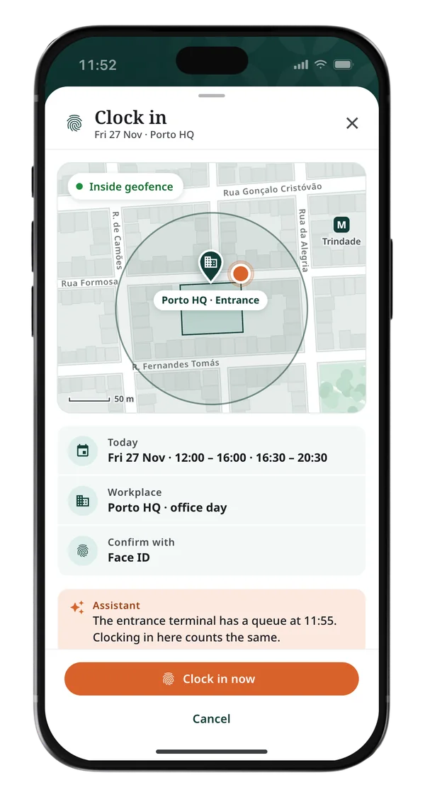
Open on her clock status, inside or outside the site’s geofence, with the clock-in one tap away and confirmed by Face ID. The assistant flags any gap before timesheets close, so payroll never surprises her.
Joaquim runs a CNC press at a metalworks in Braga with 1,200 people on the payroll. His week never changes: in at 8:00, lunch at 12:30, out at 17:00. He uses the app the same way every day: clock in, glance at the confirmation, phone back in his pocket.
The canteen only cooks what was booked by Thursday, and booking lived in a separate portal he had to open on a computer. He forgot twice in one month and paid for lunch at the café across the road.
- Clock in without joining the queue at the machine
- Book next week’s lunches in under a minute
- Ask for a day off without leaving the line
- Opens the app at 7:58, 12:30 and 17:00
- Picks the same dish most days
- Happy with apps, impatient with menus
- Canteen booking lived in a separate portal
- Five taps to reach his own attendance
- Queues at the clocking machine at shift change
Bring canteen booking into the employee app, beside attendance and time off, and let autopilot book his usual on office days when it is on the menu, with time to cancel.
António runs the cutting and sewing floor at a garment factory near Guimarães: 42 people across two shifts. His day starts at 6:45 with one question, who is in and who isn’t, because three missing machinists can hold up an order that ships on Friday.
About fifteen leave and absence requests reach him every week, and next week’s rota has to be out by Wednesday. The old app sent him to the web for half of this, so he often ended up approving requests at night from his laptop.
- Know by 7:00 who is missing today
- Clear routine requests without opening each one
- Publish next week’s rota by Wednesday
- Walks the floor first, then checks the app
- Approves requests on the move
- Keeps a paper rota as a backup
- No single view of who’s out today
- Approvals split between the app and the web
- Rota changes reach the team too late
Give managers an app of their own, on the desktop and on the phone, opening on who is in, what needs approving and what the AI already handled, so routine requests never wait for him and only the exceptions do.
One product, split in two
Research settled the shape of the product before any screen was drawn. Both apps run in the browser, on the desktop and on the phone, and this page shows each where it gets used most.
Maria and Joaquim clock in on the floor, António runs the shift from an office, and the shared home fit none of them. It was the loudest complaint in research.
A role switch built every screen for two people, and phone plus web left António switching tools mid-task. Two apps meant a second front end, kept small by one engine and one set of components.
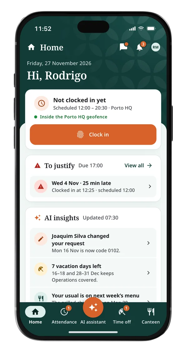
- Clock in inside the site’s geofence, with Face ID
- Gaps flagged before the timesheet closes
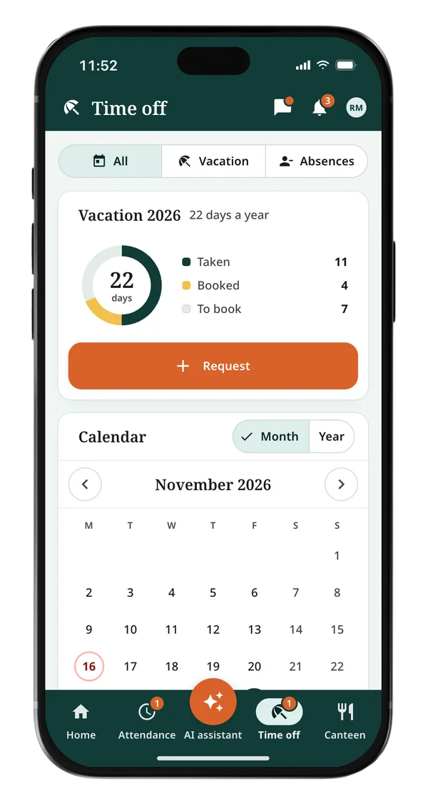
- Time off and canteen, a few taps each
- An assistant that reminds, answers and books
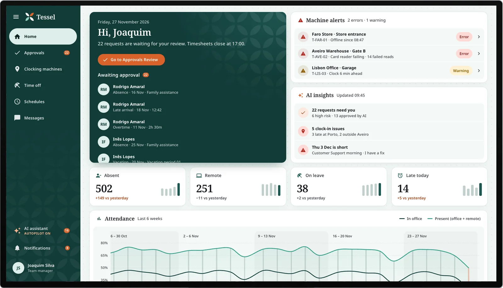
- Who’s in, out and late, the moment it opens
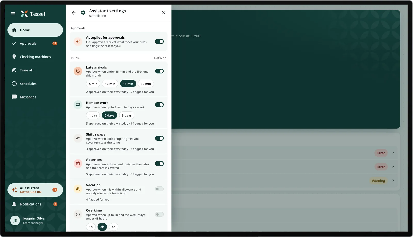
- Approvals on autopilot, within their own rules
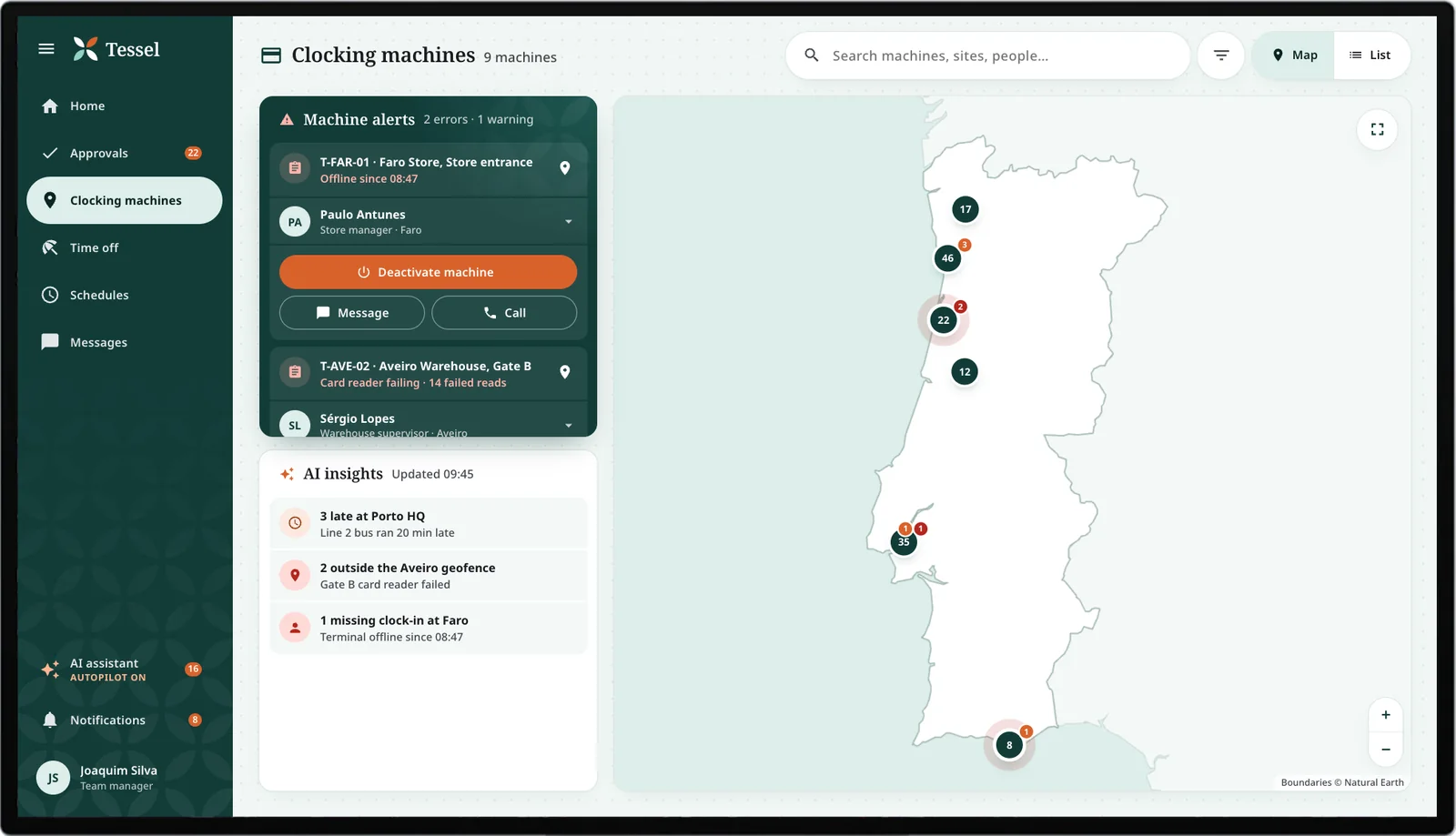
- Clocking machines and their alerts on a map
- Rota gaps flagged, with a fix suggested
Two apps, one engine
Whatever a worker sends and whatever a manager decides goes through the same engine, and that is where the autopilot works.
From boxes and arrows to real screens
Both apps started as wireframes in Miro, sketched as one connected flow before any visual design. Cheap to draw, cheap to change, and reworked until the structure held.
ponto
Why the order mattered
The apps could have shipped a dozen features at once, but the development team had no room to build and maintain them all. So I built what people were angriest about first, and let the rest follow by how much it hurt to live without.
Workers never knew if a clock-in had registered, and a wrong entry could cost them at payday. I led with the home screen that shows your last punch on open: the question workers asked most, answered cheaply with data the system already held.
Next came acting on it: requesting a day off or holiday from the phone. I held these back until testing fixed a confirmation gap, since a request you can't tell went through is worse than none.
Managers clear approvals and check who is in every day; the shift rota is a weekly job. So the dashboard and one-tap approvals shipped before the fuller scheduling tools.
Nice-to-haves like canteen booking and a richer schedule became fast follows, close behind launch, so they never delayed what people were actually waiting for.
Only once people trusted the basics did the routine go to AI: approvals within each manager’s own rules, replies to routine questions, reminders before a deadline. There was no point automating an app people didn’t trust yet.
Rebuilt on Material and tuned for the final users
Both apps carried over the web version’s Material Design foundation instead of reinventing it. The patterns stayed familiar to users, and there was far less for the team to maintain.
Contrast was measured against WCAG throughout. Text in the core green on white clears 12.1:1, comfortably past the AAA bar, so the screens stay legible for everyone.
Colour is never the only signal, and it means the same in both apps: red for errors, green for what checks out, and orange for the assistant and the next thing to do.
Noto Serif for titles and Noto Sans for everything else, with weight rather than size doing the work of hierarchy. Greys stayed above the minimum contrast, so secondary text is still easy to read.
Language was a design input from day one. A Brazilian team building for European Portuguese users worked from a PT-PT glossary, then shipped in Spanish, English (UK) and French.
Tessel Employee: proof at a glance
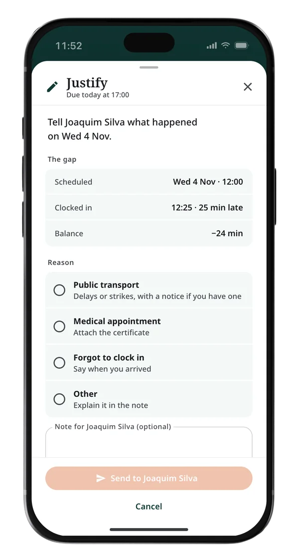
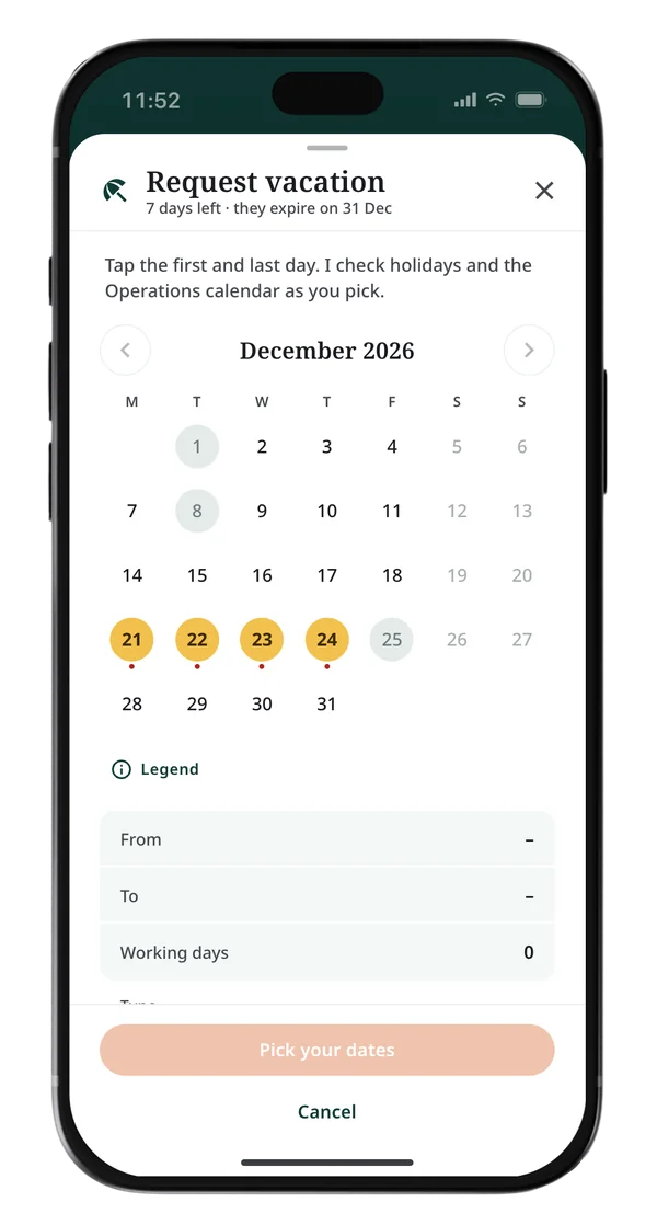
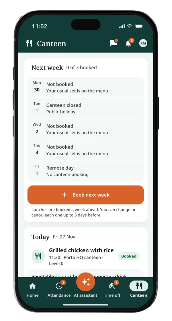
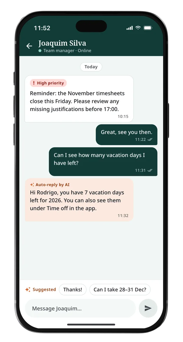
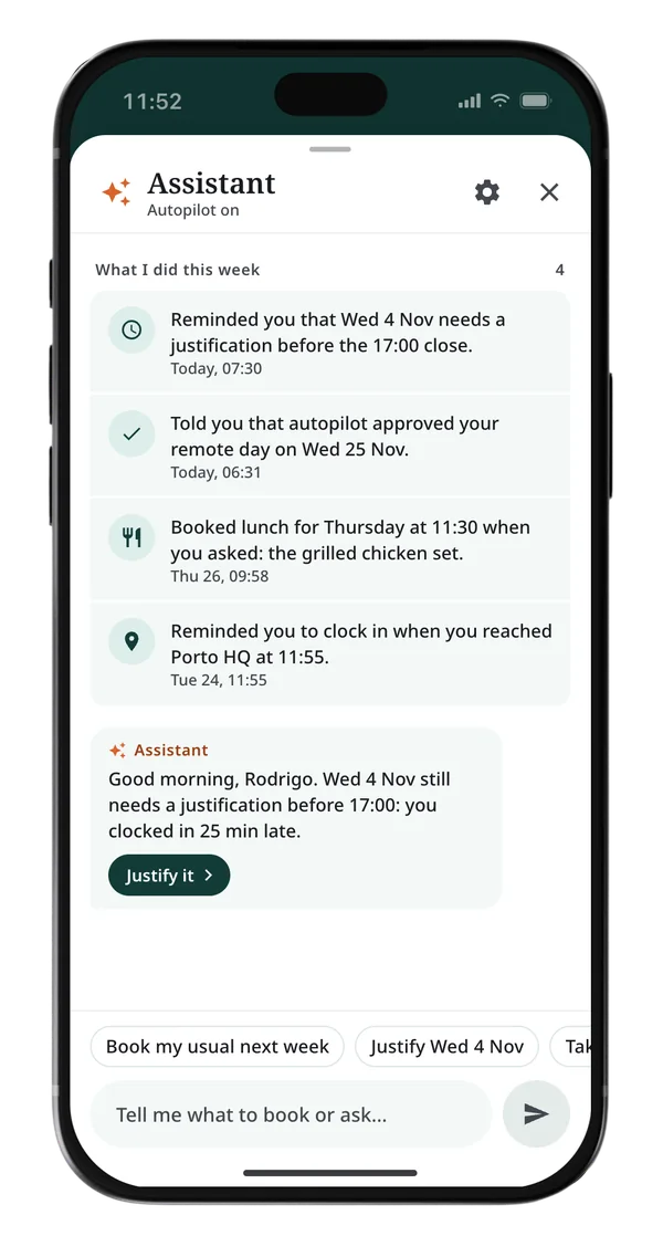
Every screen answers a worker’s real question fast, starting with the one Maria and Joaquim asked most: did my clock-in count? Where something needs doing, the assistant says so first.
Clocking in from the phone also clears the queue at the machine, where hundreds of people can turn up at once at shift change. The map is what keeps it honest: the button only works inside the site’s geofence, with location switched on, so nobody clocks in from the sofa.
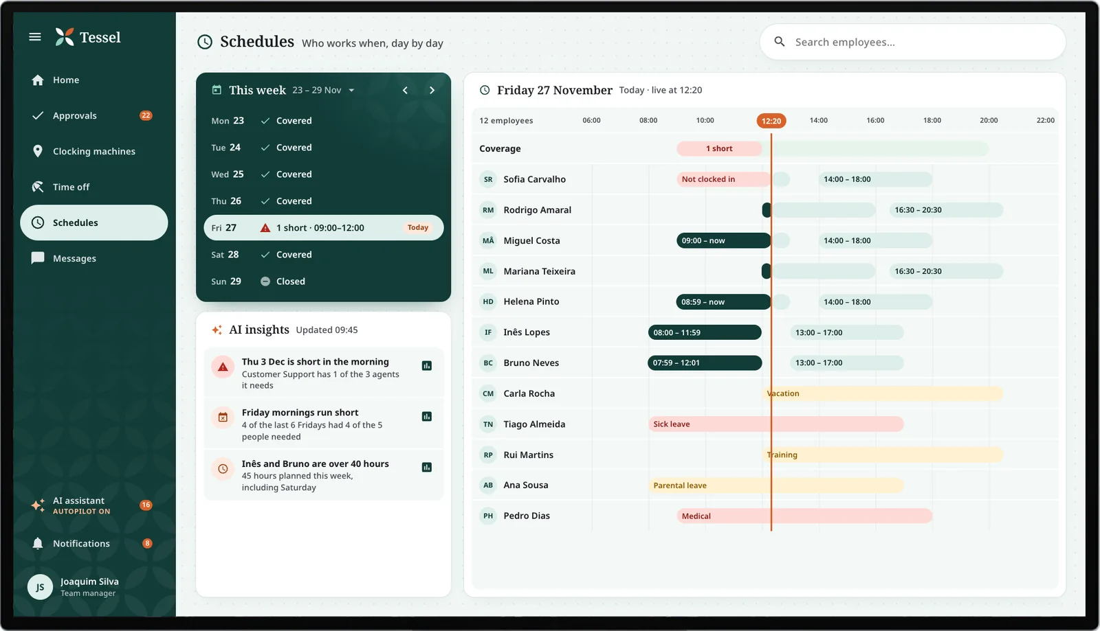
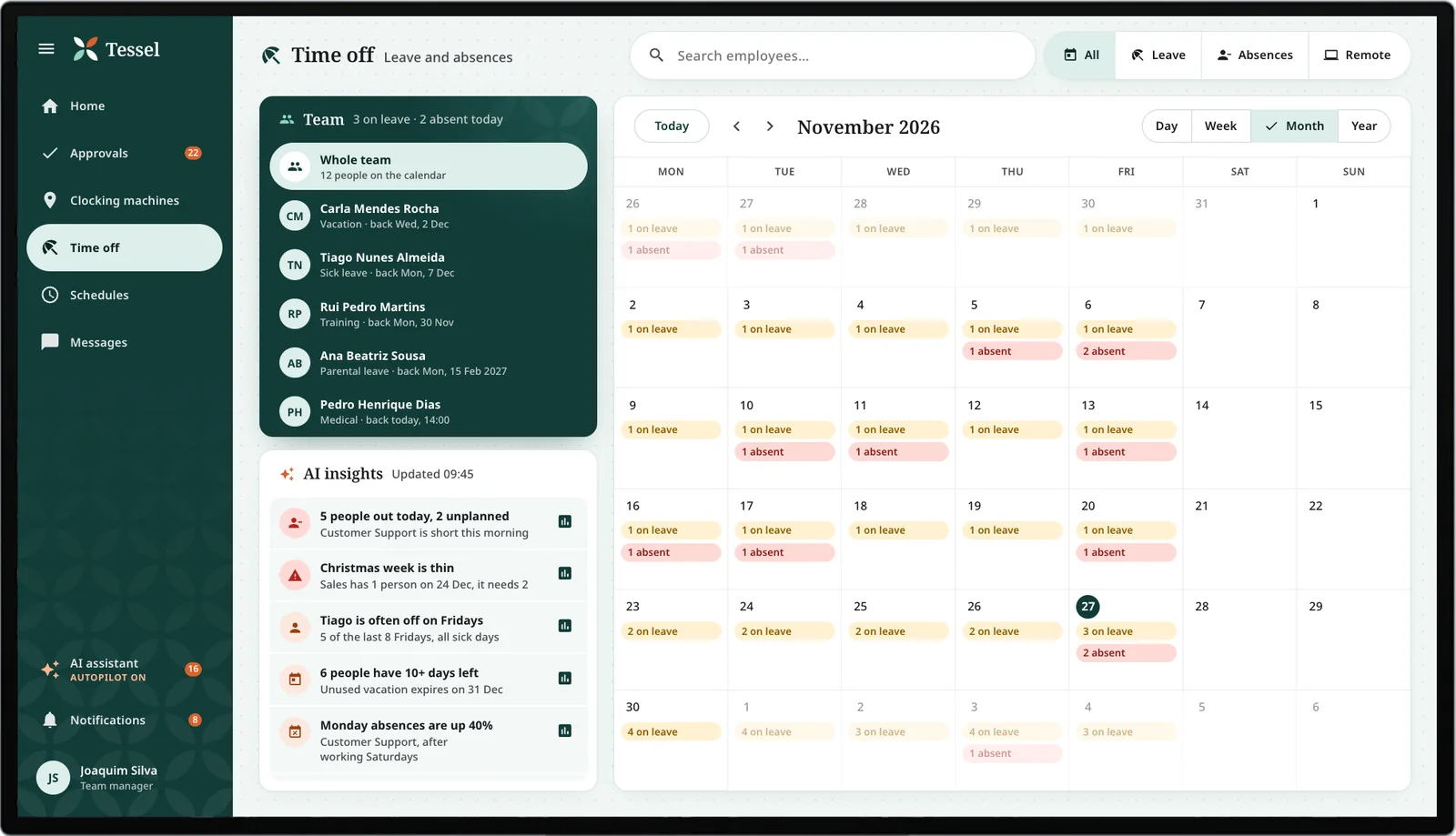
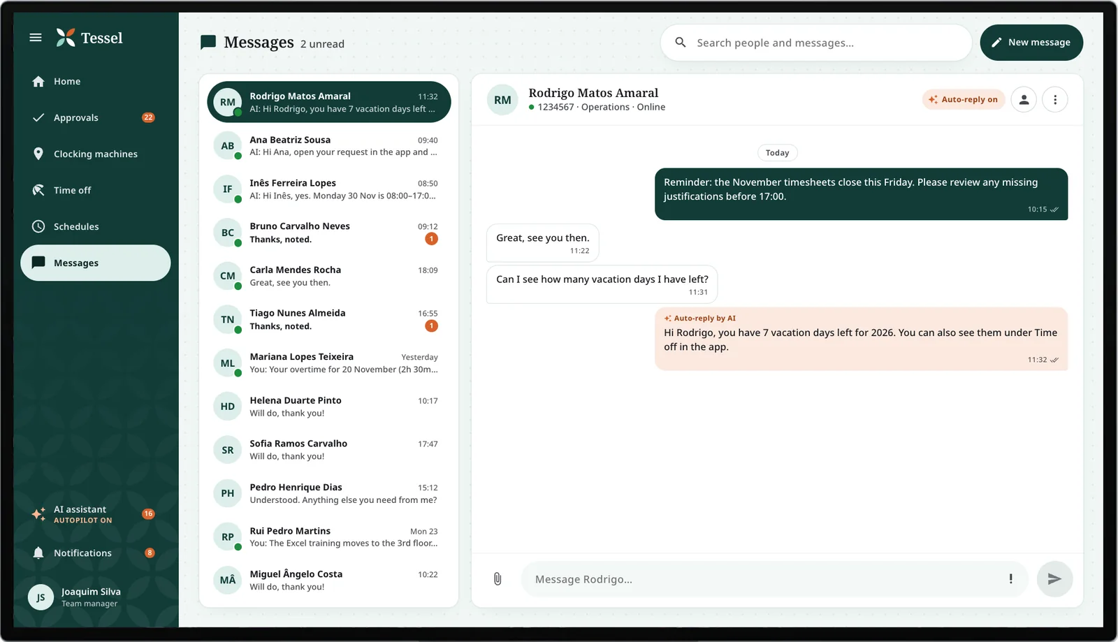
Tessel Manager: the floor on autopilot
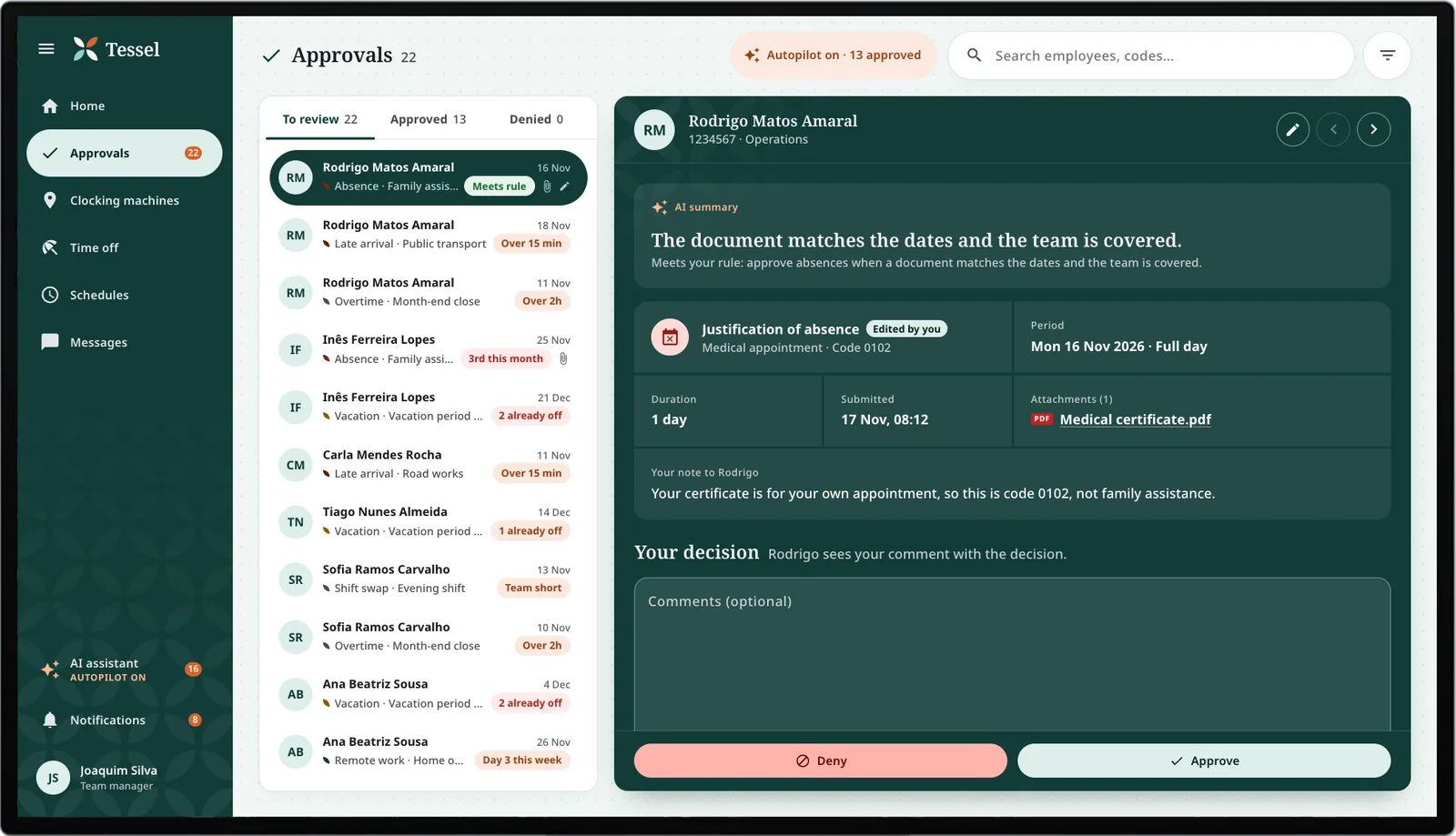
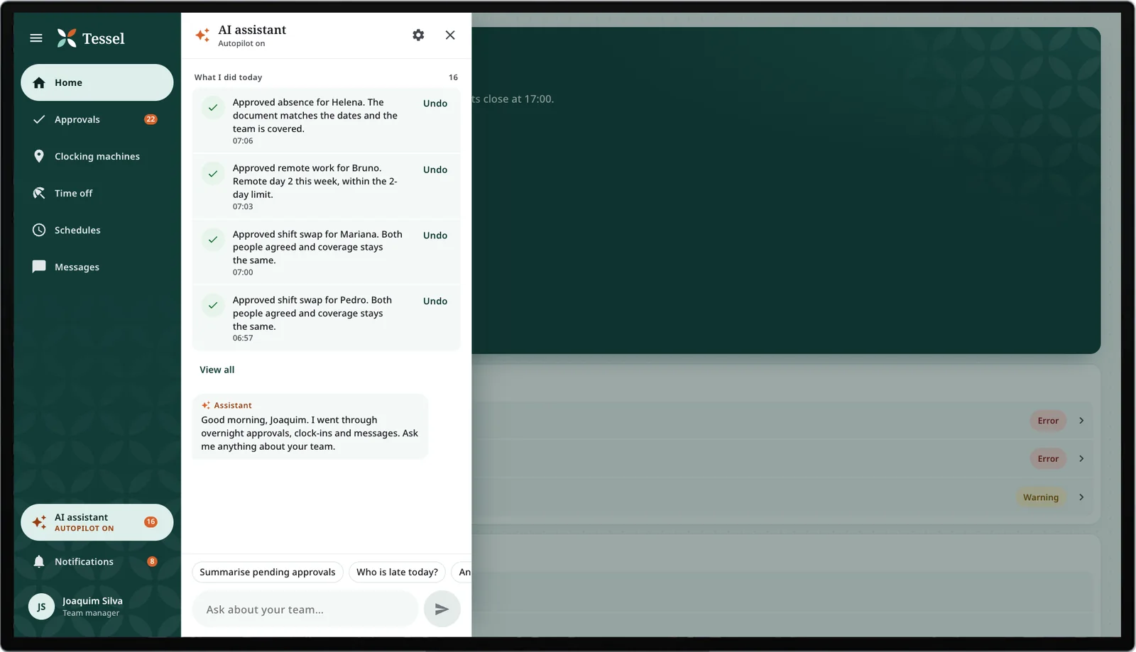
An app of its own that opens on the day, so António sees who’s in, what’s waiting and what the AI already handled, and only steps in where it flags him.
From tolerated to trusted
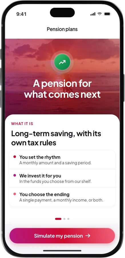
Set the legacy home beside today’s: a wall of options nobody enjoyed opening became a calm screen that answers the first question of the day, with the assistant already pointing at what needs doing.
The legacy app
- The home was a list of every option at once, and nothing on it said whether you had clocked in.
- Workers and managers shared one app with two logins, a shell built for neither of them.
- A missing punch only showed up when payroll closed, too late to fix it calmly.
- Every request waited for a manager, however routine it was.
- Layouts fell apart on newer, larger phones.
Tessel today
- It opens on your clock status, whether you’re in and inside the site, with the clock-in a tap away.
- Two apps, one for each job, so nobody shares a login or a home built for someone else.
- The assistant flags what needs you, a gap to justify, days about to expire or a lunch to book, before it turns into a problem.
- Routine requests are approved within the manager’s own rules, each one listed and reversible.
- Contrast is checked against WCAG, and the apps shipped in four languages, starting with European Portuguese.
Six sessions before handoff
Before I called the prototype done, I ran six moderated remote sessions on it, solo, with four floor employees and two team managers from outside the company, people who had never seen the product. Each one thought aloud over a video call while sharing the Adobe XD prototype on their own screen. The core flows held up, and it scored 84 out of 100 on the System Usability Scale, the standard usability survey testers fill in at the end.
A good score can still hide where things break, so every tester ran missions, the real jobs of a working day: four for the workers and one for the managers. Success, time on task and taps off the intended path show where the flow held and where it leaked.
The entry. Clock in inside the geofence and find proof that it counted.
Comprehension. Explain Tuesday’s 25-minute gap before timesheets close.
Discovery. Ask for next Friday off, starting from the home screen.
Confidence. Send the request, then say whether it arrived.
Managers. Clear one pending absence from the home screen.
What testing changed
Four issues came out of the sessions, three of them behind the weak missions, and each one changed the build before handoff.
Two of four sent an absence request, saw no sign it had worked, and sent it again. The app never told them it went through. A clear success screen fixed it.
Three of four dug through the calendar and menus to find how to request time off. It wasn't where they looked. I moved it to a labelled button on the absences screen.
Both managers froze on the pending count, afraid one tap would approve everyone at once. I made it open the list instead, and kept approval to a tap per request.
One worker caught a canteen label that sounded Brazilian to a Portuguese ear. A small thing, still wrong for its users. Fixed against the PT-PT glossary.
Autopilot, with a person in charge
The autopilot came after launch, once AI could read a medical note and check it against the rota in seconds. HR teams were losing hours to that kind of back-and-forth, so the apps let a manager hand the routine to AI and keep the judgement calls.
Both prototypes are complete, unhappy paths included, from a clock-in outside the geofence to a Face ID that fails.
From João’s phone and back
João asks for tomorrow off. Nobody else is out and the shift is covered, so there are no grounds to say no, and making him wait would add a day and change nothing.
In testing, people worried that one tap could approve everyone at once. So every automatic decision lands in a list with Undo, and the autopilot ships switched off: onboarding explains it, and each company decides.
What happened after handoff
I handed off a build-ready prototype, signed off screen by screen, and the product kept growing from there into the agentic apps it is today. After launch, the numbers moved where it mattered.
The client took to it fast and read it as a sales lever, the mobile edge their sales team had asked for in the interviews.
The project won the company’s internal prize for best solution for an international client, and I was invited to present it to the whole company, more than once. Getting to tell its story to the people I had built it beside meant as much as the sign-off.
What the project taught me
Four things from this project stuck, and I lean on all of them now.
Nobody chose this app; their employer handed it to them. What won them over was small: seeing their punch had counted the second they opened it. I bring that starting point to every internal tool now.
When the other designers rolled off halfway through, only the documentation carried the thread. Now I write and share as if I could be gone tomorrow, so the work holds together as the team changes.
I’d rather ship an AI that shows what it did than a clever one. In Tessel every automatic action is listed, labelled as AI and one tap from Undo, because a manager who can’t check it will switch it off.
A request for a Friday off used to take days of messages, with the answer in the system all along. Now agents read the request, the rota and the rules together, and people keep the calls that need a person.