A profitable product young users didn't relate to
The institution's private pension product was, by every financial metric, genuinely profitable. Yet its Net Promoter Score sat at 13, the "Improvement" zone and the single lowest-performing category across the entire mobile banking and insurance provider app.
Stakeholders flagged a compounding problem: while 25–35 year olds represent the ideal age for starting a pension plan, this demographic accounted for only 13% of actual enrollments. The product was invisible to its most commercially valuable cohort.
An irreversible tax-regime choice with no plain-language guidance. 53.9% of testers exited mid-flow to search elsewhere, matching NNG's finding that jargon at commitment points causes abandonment.
Benefits were buried below legal disclaimers several scrolls deep. NNG's F-pattern research explains the result: content past the first scroll is rarely read.
93.2% of respondents were already researching investments. The product's language addressed someone decades older. Only 13% of enrollments came from the target cohort.
No path to add a second plan. The interface implied a one-plan limit, cutting the upsell at the exact moment a user was actively committing.
No dashboard, no notifications, no balance after enrolling. NPS research consistently links post-enrollment silence to trust erosion. An NPS of 13 confirmed it.
The simulation showed a monthly income figure but not how long it would last. For a 30-year horizon, that gap was disqualifying. Longevity anxiety is the top concern NPS respondents cited.
Double Diamond Methodology
The Double Diamond runs on one principle: diverge, then converge, twice. The first diamond expands to understand the real problem before narrowing to a defined brief. The second expands in ideation before converging on what gets built. Each diverge is permission to explore without committing. With an NPS of 13 and stakeholders who believed the audience was financially passive, skipping the first diamond meant designing for the wrong user.
The research discoveries that rewrote the brief
Stakeholders arrived convinced of one thing: young people were financially passive and indifferent to retirement. Before redesigning anything, that assumption had to be put to the test.
What the data said about Gen Z
Secondary research across the UK, US and Portugal told one consistent story: this generation invests earlier and more actively than any before it, yet it leaves retirement out almost entirely.
the Radar
Across all three markets, 75% of Gen Z aren't preparing for retirement. The willingness to plan ahead exists, it simply goes elsewhere.
In the US, 22% hold stocks and 11% hold crypto. Gen Z teenagers invest more than the teenagers of any prior generation.
They save roughly a third of their income, and 93% plan to buy a house. The long-term mindset is already there.
Only 14% put any money toward retirement, because it reads as a distant, someone-else's problem rather than a goal for now.
Robinhood made the point concrete. It is a US commission-free investing app that lets people buy stocks and crypto from their phone with no minimum balance, built specifically for first-time, mostly young investors.
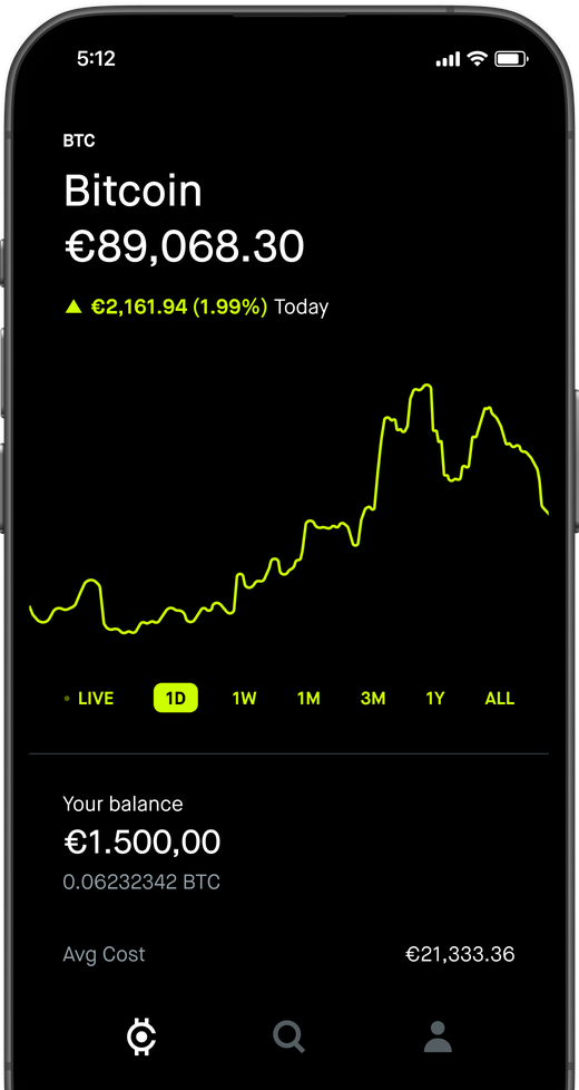

It reached 13 million young users by making investing simple and social, enough to push Goldman Sachs into launching its own fee-free youth accounts. The appetite is there when the experience is built around how this generation thinks.
Competitors: the goods & bads
The benchmark spanned national investment apps, national pension simulators, and international tools.

- Functional investment room with everything in one place.
- Dense, text-heavy screens that read like a contract.



- Concise, the whole simulation on one clean screen.
- You still had to switch to the app to contract.


- Ran inside WhatsApp, an interface everyone knows.
- Never made the calculation options clear.

- Most intuitive of all, breadcrumbs showed steps left and contextual cards explained jargon in place.
- Naturally built around Inter's own products.

- Edit any input and watch the total update live.
- The updated number only showed after scrolling up.
International simulators only reinforced the point. They were dense, and their input fields diverged so far from the Brazilian market that none could serve as inspiration. The following institutions were studied.





But it all still needed confirmation: a user survey
The stakeholders' read was that this generation simply wasn't ready for pensions, too young, too disengaged, in need of financial education before they would ever contract one. Before redesigning a single screen, the real question was whether that was actually true. A quantitative and qualitative survey went out on Google Forms, shared across social media, letting the audience answer for itself.
Four answers settled it: this audience already invests, researches finance on its own, tracks its money closely, and plans years ahead.
Three in four respondents already held investments, and not timid ones: fixed income, stocks and funds, even real assets. The appetite for putting money to work was clearly there.
More than seven in ten actively sought out financial information, but they went looking for it on their own terms, on the platforms where they already spend their time.
More than nine in ten kept a close eye on their money, and they did it digitally, in apps and spreadsheets.
A pension lives or dies on one trait: a long time horizon. And it was nearly universal here, nineteen in twenty named dreams a decade or more away. The mindset a pension needs was already in place.
Research Synthesis
The audience was engaged, financially literate and planning a decade ahead. The missing piece was simply a product that spoke their language.
Three faces in the data
The desk research, the benchmark, and the survey converged on three recurring profiles. A persona was built around each, grounded in the responses and behaviours observed, and every one carried a specific friction that shaped a design decision later in the project.

Already invests, but can't connect a pension to any real goal in his life. The journey feels built for his parents.

Has a pension she's never understood, and is afraid of locking money on terms and risk levels she can't see.

Gen Z app-investor who finds pensions old, slow and irrelevant, and bails the moment a screen gets text-heavy.
Lucas already invests through apps, stocks, CDBs and a bit of crypto, checks his portfolio every week, and plans to buy an apartment within the decade. Pensions have never connected to any of that: the existing flow reads like something built for his parents.
- Buy an apartment within 10 years
- Retire with financial independence
- Understand exactly where his money goes
- Uses app-native investing platforms
- Monitors stocks and CDBs monthly
- Researches finance on Instagram & YouTube
- Can't connect pension to a real life goal
- Progressive vs. regressive tax, no idea
- Journey feels designed for his parents
Lucas needs the journey to open on a life goal, with progress toward it visible from the first screen. The language has to be plain, with zero jargon, and the whole flow has to work on his phone. He commits once the payoff is on the table.
Renata holds a pension she has never fully understood. She reads every term before signing, calls the bank when in doubt and keeps her money in conservative funds, and her biggest fear is locking it on conditions she cannot see, with risk levels labelled “Conservative” and never explained.
- Know exactly what her pension returns
- Not lose money to poor fund choices
- Feel in control of her retirement
- Reads all terms before signing anything
- Calls the bank to clarify doubts
- Conservative fund preference, low risk tolerance
- Risk levels (“Conservative”) unexplained
- No visibility into fund portfolio composition
- Afraid of locking money without understanding terms
Renata needs every fee, term and risk level spelled out, and explained at the moment it matters. She wants to see what a fund is made of and what each choice means for her money, with the conditions visible before anything locks in.
Caio invests through gamified, social-first apps and compares products on social media before committing. He wants passive income now rather than at 65, bails the instant an interface turns text-heavy, and will not engage until he can see a concrete payoff.
- Generate passive income now, not at 65
- Invest with the least possible friction
- Understand risk intuitively, without jargon
- Uses gamified, social-first investing apps
- Skips lengthy onboarding without hesitation
- Compares financial products on social media
- Pension “feels old”, not relevant to him
- Text-heavy interfaces kill engagement momentum
- No immediate value proposition visible
Caio needs one simple step per screen and no walls of text. He wants a concrete preview of the payoff up front, and he drops a long onboarding without hesitation, so the product has to let him explore instantly.
Design Sprint: 4 days, 1 plan
A Design Sprint is a structured, time-boxed workshop created at Google Ventures and popularised by Jake Knapp’s book Sprint. It pulls the people who own the problem into one room for a few focused days to map it, sketch solutions and commit together, so decisions carry institutional weight and rarely get reversed later in review. Research that lives in a deck changes nothing, so before opening Figma I facilitated a 4-day Design Sprint with the insurance division, product owners, finance leads and compliance officers alongside the design team.
Who joined the sprint
From problem to wireframe
Four days, each with one job that set up the next: tear into the current journey, study the competition, confront who the audience really is, then sketch solutions as a group.

Me, You & Your Insurance
- Opened by laying out everything the research had surfaced so far
- Tore into the current pension journey, naming where it lost people
- Got the room aligned on the premises everyone would build from
- Pinned down a single, shared objective for the week

Psychoanalysis of Competitors
- Recapped day one to carry the momentum forward
- Put competing products on the couch, dissecting what worked and what didn't
- Pulled the sharpest insights out of the teardown

Are Pensions Cringe? (#GenZ)
- Brought public data to the table to ground the conversation
- Set generations against pensions to expose the real disconnect
- Sketched early concepts for a product that could actually land
- Mapped the long-term goals the audience genuinely cared about
- Asked the hard question: how do you make pensions captivate this crowd?

Getting Hands Dirty
- Circled back to the objectives, assumptions and target to keep the solutions honest
- Split into three trios, each co-creating a competing proposal for the journey
Sprint Synthesis
Four days turned a misread "passive" audience into a clear design target, and produced the competing proposals that became the first prototype.
An architecture that earns trust, one step at a time
In Figma, I prototyped a solution that was never one person's vision, but a conglomeration of sprint ideas, narrowed by vote, with the Director of Product holding the final word. Every screen ran on progressive disclosure (Nielsen Norman Group): in a financial flow where every jargon term is a potential exit, terminology was replaced with plain language or explained inline, always within the step.
The 8-Step Journey Architecture
Every screen in the flow was deliberate. Step 4, the wallet preview, is the strategic hook that changed everything.
1Simulation Start
Opens with what a pension actually is, in plain words, before asking for anything.
2Life Goal
Starts from what the money is for, so the journey speaks in goals instead of forms.
3Time & Amount
Two inputs and nothing else: how many years, and how much a month.
4Wallet Preview
Shows the payoff before asking for commitment, the hook the whole journey turns on.
5Taxation
Explains progressive against regressive at the moment the choice is made.
6Risk Coverage
Offers the optional cover as a decision, never as a default buried in the terms.
7Confirmation
Every fee, term and condition laid out in full before anything is signed.
8Conclusion
Confirms what was contracted, and says plainly what happens next.
Testing face to face with real users: AI set aside
Prototype in hand, it went in front of real people, two ways.
The score was solid, but a score hides where things break. So the test wasn't a click-through: each tester ran five missions, the real tasks that carry someone from a first simulation to a signed contract. Each mission's success rate, time, and off-journey taps (leaving the intended path) show exactly where the journey holds and where it leaks.
The entry. Set a 30-year goal and a R$3,200/mo contribution, then read the projection.
Editing. Change the monthly amount to R$450 and watch the plan recalculate live.
Comprehension. Make sense of a risk option labelled “Conservative” without leaving the step.
Decision. Pick a tax regime and read the recommended fund portfolio.
The close. Add Risk Coverage and finalize by agreeing to the terms.
What the test confirmed
The prototype held up. Across 13 sessions it scored 90/100 and was widely approved, testers called the journey easy, objective and quick, and completed every proposed task, no one was left not knowing what to do. Its two soft spots, finding risk information (Mission 3) and closing with Risk Coverage (Mission 5), set the clearest priorities for the next round.
Where it all comes together
Five steps, one flow: the pieces the journey turns on, with the prototype in the middle.
From the app's weakest product to its strongest
After launch, the numbers moved across the board (the institution's reported figures).
Where it goes next
Scoped during the project but left unbuilt, ideas for the insurer to ship in a future phase.
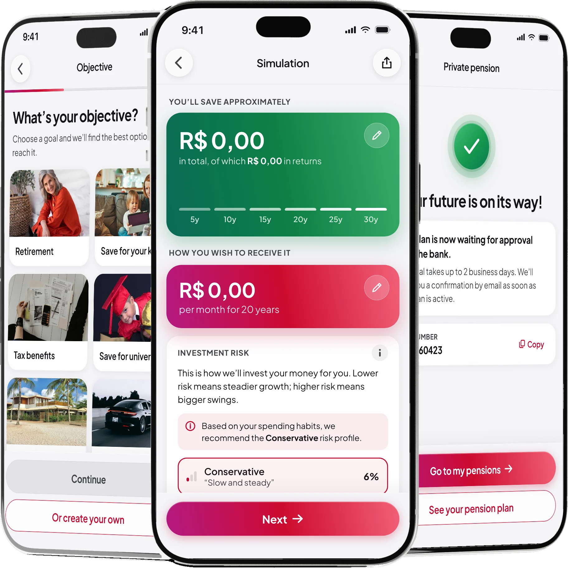
A pension room
One place to see and manage every plan a user has contracted.
Portfolio at a glance
Total invested, fund performance, and allocation in a single view.
Manage from inside the app
Adjust contributions, redistribute funds, or redeem part of a plan.
First to market
Nothing like this exists in Brazilian private pension yet, the opening is to be the pioneer.